
Webフロントエンドエンジニアのメロメロンです。
参考サイトを漁るのが好きで、暇さえあれば「この演出いいな〜」「この動き気持ちいいな〜」といった発見をメモしています。
そんな中で見つけた、「ポートフォリオに取り入れてみたいな」と思ったアニメーションをいくつか紹介します。
ポートフォリオじゃなくても、もちろんOK。
ただ、クライアントワークだと、ブランドイメージやトンマナを優先しなきゃいけないから、どうしても自由にはいかないですよね。
ポートフォリオなら世界観も自由に作れるので、自分の好きなように演出できて楽しい…!
今回は、実装にも挑戦してみたので、コードも一緒に載せてみようかなと思っています!
💡 参考サイト
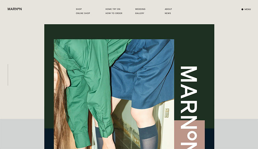
https://marnon.jp/(パンプスのサイト)
ところどころに入った可愛いアニメーションがとても好みで、「これ好き!」が詰まったサイトでした🩷
💡 真似したいアニメーション
①マスク切り替えの画像スライダー
フェードで切り替わる画像スライダーはよくあるけど、こちらは波模様のマスクで切り替わるのが新鮮でした。
ふわっと広がる感じがとにかく可愛い🩷!
パンプスのサイトだから、パンプスの曲線をイメージしてるのだろうか…💭
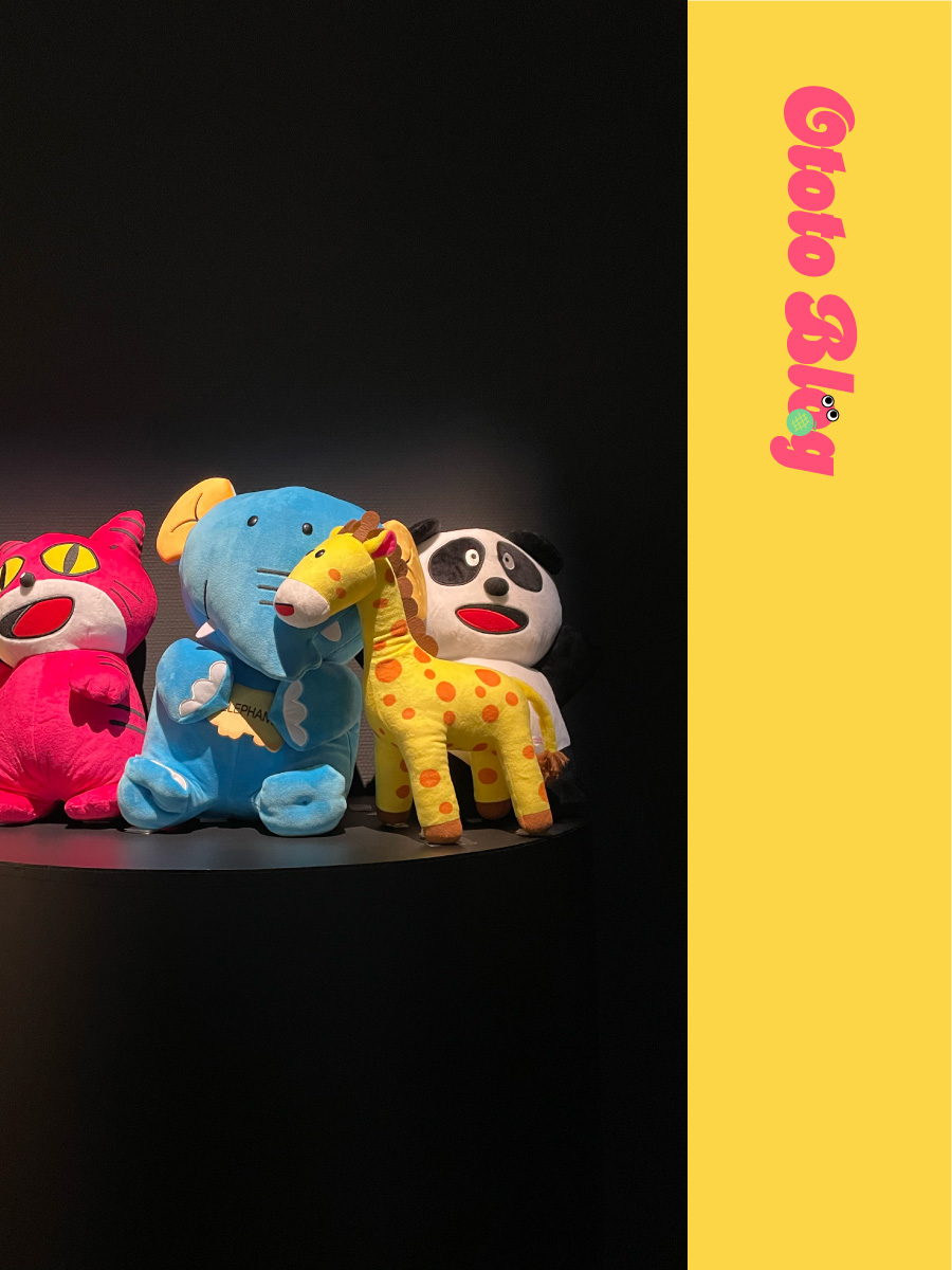
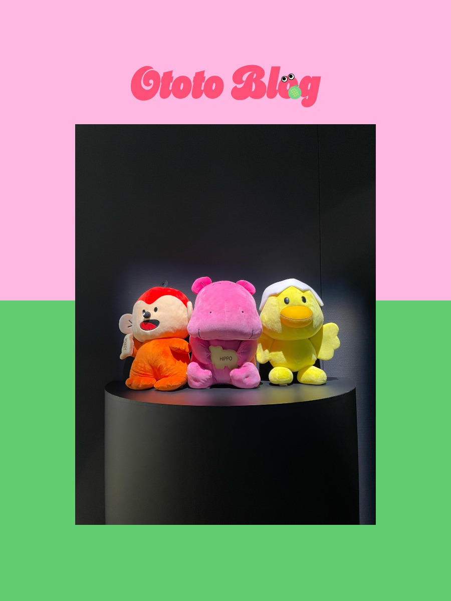
たべっこどうぶつの画像でサンプル作りました🐒
3枚以上だったらこのままのコードで使えると思います。
マスク画像は好きな形を用意してみてください◎
 <div class="mySlider">
   <div class="mySlider__cont">
     <ul class="mySlider__phs">
       <li class="mySlider__ph">
         <img class="mySlider__img" src="slide_1.jpg" alt="">
       </li>
       <li class="mySlider__ph">
         <img class="mySlider__img" src="slide_2.jpg" alt="">
       </li>
       <li class="mySlider__ph">
         <img class="mySlider__img" src="slide_3.jpg" alt="">
       </li>
     </ul>
   </div>
</div>.mySlider__cont{
max-width:100%;
width:400px;
margin:100px auto
}
.mySlider__phs{
position:relative;
padding-bottom:133.33333333333331%
}
.mySlider__ph{
position:absolute;
width:100%;
top:0;
left:0;
-webkit-mask-image:url("マスク画像");
mask-image:url("マスク画像");
-webkit-mask-size:100% 260%;
mask-size:100% 260%;
-webkit-mask-repeat:no-repeat;
mask-repeat:no-repeat;
-webkit-mask-position:0% 170%;
mask-position:0% 170%;
webkit-mask-size:100% 260%;
webkit-mask-repeat:no-repeat;
webkit-mask-position:0% 170%;
z-index:0
}
.mySlider__img{
width:100%
}// Gsap読み込み
import { gsap } from "gsap"
window.gsap = gsap
const phs = document.querySelectorAll('.mySlider__ph')
const length = phs.length
let current = 0
let after = 0
let before = 0
// Init
gsap.to(phs[current], {
maskPosition: "0% 50%",
duration: 0,
})
count()
function count() {
const timeline = gsap.timeline()
before = current
after = current + 1
if(after === length) {
after = 0
}
current++
if(current === length) {
current = 0
}
timeline.to(phs[after], {
maskPosition: "0% 50%",
duration: 1.3,
ease: "power1.out"
})
.to(phs[current], {
zIndex: 1,
}, 0)
.to(phs[before], {
zIndex: 0,
}, 0)
.to(phs[before], {
maskPosition: "0% 200%",
duration: 0,
})
setTimeout(count, 7000)
}②インビュー時のクリップアニメーション
スクロールして画像が見えたときに、まず背景のグレーが出て、あとから画像が出るアニメーション。
clip-pathで制御されているみたいです。
パンプスだから、足元から表示するように工夫しているのでしょうか…?💭
ただ表示するより、印象に残るし、丁寧な感じがして素敵です🩷
<div class="myClip">
  <div class="myClip__cont">
    <div class="myClip__box myClip__box--1">
      <div class="myClip__bg"></div>
      <div class="myClip__ph">
        <img class="myClip__img" src="/assets/images/slide_3.webp" alt="">
      </div>
    </div>
    <div class="myClip__box myClip__box--2">
      <div class="myClip__bg"></div>
      <div class="myClip__ph">
        <img class="myClip__img" src="/assets/images/slide_1.jpg" alt="">
      </div>
    </div>
  </div>
</div>.myClip__cont{
max-width:100%;
width:700px;
margin:0px auto
}
.myClip__cont:after{
content:"";
display:block;
clear:both
}
.myClip__box{
position:relative
}
.myClip__box--1{
float:left;
width:45.714285714285715%
}
.myClip__box--2{
float:right;
width:32.857142857142854%;
margin-top:32.857142857142854%
}
.myClip__box.inview
.myClip__bg{
transform:scaleY(1);
clip-path:inset(0 0 0 0);
transition:transform 1s cubic-bezier(.25,1,.5,1) 0s,clip-path 1s cubic-bezier(.25,1,.5,1) .45s
}
.myClip__box.inview
.myClip__ph{
transform:scaleY(1);
clip-path:inset(0 0 0 0);
transition:transform 1s cubic-bezier(.25,1,.5,1) .5s,clip-path 1s cubic-bezier(.25,1,.5,1) .95s
}
.myClip__bg{
position:absolute;
top:0;
left:0;
right:0;
bottom:0;
background-color:#ff5076;
clip-path:inset(100% 0 0 0);
transform:scaleY(0)
}
.myClip__ph{
position:relative;
z-index:1;
clip-path:inset(100% 0 0 0);
transform:scaleY(1.05)
}const boxs = document.querySelectorAll('.myClip__box')
//交差監視
const observer = new IntersectionObserver(callback, {
rootMargin: "0% 0% -20% 0%"
})
boxs.forEach(box => {
observer.observe(box)
})
function callback(entries) {
entries.forEach(entry => {
if(entry.isIntersecting) {
entry.target.classList.add('inview')
}
})
}③バラバラ→整列するギャラリー画像
ギャラリーで画像がバラバラに重なって表示されてから、整列していく演出が印象的でした。
イージングの感じも自然で、つい見入ってしまいます。
何回もリロードして見返しちゃいました😹(笑)
<div class="myGallery">
  <div class="myGallery__cont">
    <div class="myGallery__line myGallery__line--1">
      <div class="myGallery__ph myGallery__ph--1-1">
        <img class="myGallery__img" src="/assets/images/slide_2.jpg" alt="">
      </div>
      <div class="myGallery__ph myGallery__ph--1-2">
        <img class="myGallery__img" src="/assets/images/slide_6.jpg" alt="">
      </div>
    </div>
    <div class="myGallery__line myGallery__line--2">
      <div class="myGallery__ph myGallery__ph--2-1">
        <img class="myGallery__img" src="/assets/images/slide_4.webp" alt="">
      </div>
      <div class="myGallery__ph myGallery__ph--2-2">
        <img class="myGallery__img" src="/assets/images/slide_3.jpg" alt="">
      </div>
    </div>
    <div class="myGallery__line myGallery__line--3">
      <div class="myGallery__ph myGallery__ph--3-1">
        <img class="myGallery__img" src="/assets/images/slide_5.webp" alt="">
      </div>
      <div class="myGallery__ph myGallery__ph--3-2">
        <img class="myGallery__img" src="/assets/images/slide_1.webp" alt="">
      </div>
    </div>
  </div>
</div>.myGallery{
padding:100px 0 30px;
}
.myGallery__cont{
width:900px;
max-width:100%;
margin:0 auto;
display:flex;
justify-content:space-between
}
.myGallery__cont.inview .myGallery__ph--1-1,
.myGallery__cont.inview .myGallery__ph--1-2,
.myGallery__cont.inview .myGallery__ph--2-1,
.myGallery__cont.inview .myGallery__ph--2-2,
.myGallery__cont.inview .myGallery__ph--3-1,
.myGallery__cont.inview .myGallery__ph--3-2{
transform:translateZ(0);
transition:transform 1.2s cubic-bezier(.165,.84,.44,1) .3s
}
.myGallery__line--1{
width:22.22222222222222%
}
.myGallery__line--2{
width:35.55555555555556%
}
.myGallery__line--3{
width:22.22222222222222%;
margin-top:16.666666666666664%
}
.myGallery__ph{
position:relative
}
.myGallery__ph--1-1{
transform:translate3d(97%,-10%,0) rotate(-10deg);
z-index:1
}
.myGallery__ph--1-2{
margin-top:20%;
transform:translate3d(125%,-135%,0) rotate(-5deg);
z-index:2
}
.myGallery__ph--2-1{
transform:translate3d(0,-50%,0) rotate(0);
z-index:4
}
.myGallery__ph--2-2{
margin-top:12.5%;
transform:translate3d(20%,-160%,0) rotate(5deg);
z-index:3
}
.myGallery__ph--3-1{
transform:translate3d(-195%,-140%,0) rotate(5deg);
z-index:5
}
.myGallery__ph--3-2{
margin-top:20%;
transform:translate3d(-97%,-177%,0) rotate(5deg);
z-index:6
}const cont = document.querySelector('.myGallery__cont')
//交差監視
const observer = new IntersectionObserver(callback, {
rootMargin: "0% 0% -20% 0%"
})
observer.observe(cont)
function callback(entries) {
entries.forEach(entry => {
if(entry.isIntersecting) {
entry.target.classList.add('inview')
}
})
}④ところどころに効いているパララックス
スクロールに合わせて、背景や要素がゆるやかに動くパララックス演出。
派手ではないけれど、全体の雰囲気を柔らかくしてくれていて、ちょっとした世界観づくりにぴったりだなと感じました。
パララックスは③と一緒に実装してみました。JavaScriptだけ追加しました!
GSAPを使うと簡単にパララックスを実装できます◎
import { gsap } from "gsap"
import { ScrollTrigger } from "gsap/ScrollTrigger.js"
window.gsap = gsap
window.ScrollTrigger = ScrollTrigger
gsap.registerPlugin(ScrollTrigger)

const cont = document.querySelector('.myGallery__cont')

//パララックス
const line1 = document.querySelector('.myGallery__line--1')
const line2 = document.querySelector('.myGallery__line--2')
const line3 = document.querySelector('.myGallery__line--3')
gsap.to(line1, {
  yPercent: 15,
  scrollTrigger: {
    trigger: cont,
    start: 'top bottom',
    end: 'bottom -20%',
    scrub: 0.3,
  }
})
gsap.to(line2, {
  yPercent: -8,
  scrollTrigger: {
    trigger: cont,
    start: 'top bottom',
    end: 'bottom -20%',
    scrub: 0.3,
  }
})
gsap.to(line3, {
  yPercent: 8,
  scrollTrigger: {
    trigger: cont,
    start: 'top bottom',
    end: 'bottom -20%',
    scrub: 0.3,
  }
})
📝 まとめ
ポートフォリオは、自分の世界観を自由に表現できる貴重な場所。
だからこそ「ちょっと気になる演出」や「好きだなと思ったアニメーション」を取り入れることで、見てくれた人の記憶に残るページになると思います。
今回は、参考サイトで見つけた中から
- マスク切り替えのスライダー
- インビュー + クリップアニメーション
- バラバラ → 整列のギャラリー
- やさしいパララックス演出
など、印象的なアニメーションをいくつかご紹介しました。
ポートフォリオに限らず、「この動き、真似してみたい!」と思ったら、ぜひ実装にチャレンジしてみてください✨
小さな演出でも、積み重ね。これからもたくさん実装していきます❤️🔥😺